"There is more importance attached to the selection of a regular uniform for a base ball club than the fraternity generally think there is...one of the last things a club should do, is to change the colors or form of its uniform."These were the words of wisdom of Henry Chadwick, one of the founding fathers of organized baseball. Way back in 1869 Chadwick knew that the appearance of a team made a big difference in how the team is perceived by the public. Quite often people form allegiances based on locality, but just as often, appearance of the uniform makes a big difference in choosing sides. The eye catching colors of the Giants' black and orange, the crisp blue and white of the Dodgers, the classy look of the Tigers' olde English D, the traditional blue pinstripes of the Yankees all play a part in the image of the organization as a whole.
Twenty years later the 1889 Spalding's Baseball Guide and Official League Book, quoted Rule #17 as stating that "Every Club shall be required to adopt uniforms for its players, and each player shall be required to present himself upon the field during said game in a neat and cleanly condition..." Of course, Spalding's being a sporting goods company, the back of that guide to the upcoming season featured an ad urging "clubs not to make the mistake of entrusting the making of their uniforms to local dealers, whose experience in this kind of work is necessarily limited." At that time the top quality jersey would have cost you $5.00. That's a hell of a bargain considering a replica Josh Hamilton jersey, not the expensive authentic replica,would cost you $100 plus tax plus shipping and handling. The 1889 Brooklyn Bridegrooms (the ancestors of the Dodgers) could have clothed their first and second nines with top quality uniforms (with some left over) for that amount.
Over the years some teams have paid particular attention to the continuity of their uniforms (the Yankees have made only minor changes to their uniforms since the early 1920's) while others seem to change every ten years or so (the Padres, Mariners, Astros and Angels were all expansion teams but have all continuously changed uniforms, color schemes and logos).
Some uniform changes are widely successful and others are disastrous. Below are my choices for the ten ugliest uniforms in the history of the sport:
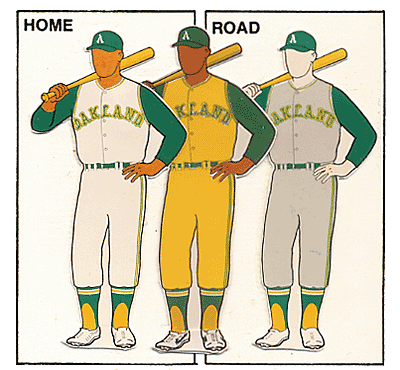
10. 1963-1974 Kansas City/Oakland Athletics
Charles Finley always tried to find new ways to draw attention to his teams. Frequent readers will remember his antics as they were chronicled during our focus on baseball in music series. Finley took over majority ownership of the Athletics in 1961 when they were in Kansas City. The A's were one of the original American League teams and had used red and white or blue and white (occasionally a combination of all three) since the league began in 1901. Just a few years after Finley took over the team , in 1963, the color scheme changed drastically to Kelly Green and Canary Yellow. The combination was usually used with a yellow shirt and white pants but as you can see from the picture of Vida Blue below, they sometimes used yellow pants with the yellow jerseys. As ugly as these uniforms were the A's were very successful during their use. In the time that they wore these uniforms the A's won division titles in 1971, 1972, 1973, 1974 and 1975 and won three straight World Series in 1972, 1973 and 1974.

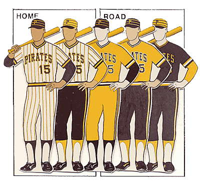
9. 1979 Pittsburgh Pirates
Similar to the Athletics organization, the Pittsburgh Pirates used a varying red and white or blue and white color scheme for decades. Although we might find it hard to believe that any team in Pittsburgh would use any color scheme other than black and gold, Pirates legends Honus Wagner, Fred Clarke, Paul and Lloyd Waner and Pie Traynor never appeared in what we consider the traditional Pirates colors. In 1946 the Pirates were purchased by a group that included the legendary entertainer Bing Crosby and two years later the team adopted the now famous black and gold. The uniform had small variations throughout the years and were usually pretty nice looking but the 1979 "We Are Family" team used the gaudy all Canary Yellow combination seen in the below photo of Willie Stargell. Also similar to the Oakland A's, the Pirates won the World Series the year these uniforms were used, coming back from a 3 games to 1 deficit to defeat the Baltimore Orioles.

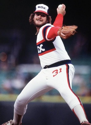
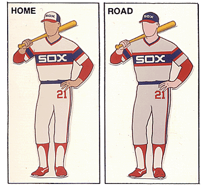
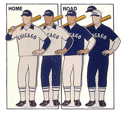
8. 1982-1986 Chicago White Sox
This won't be the last time you see the White Sox on this list but these uniforms (seen modeled below by Pitcher Lamaar Hoyt) are definitely hideous. It could be the font of the Sox across the chest, the odd positioning of the numbers on the leg or just the odd striping patterns that make these uniforms among the ugliest ever. Regardless, the ChiSox won the 1983 American League West but lost in the American League Championship Series to the Baltimore Orioles. These uniforms lasted until 1986. They were replaced for a few years by slightly nicer uniforms with the same color scheme but with a script "White Sox" on the home jersey and "Chicago" for the away jersey. The current black and white (a throw back to the days of the early years in the league) were debuted in 1990.
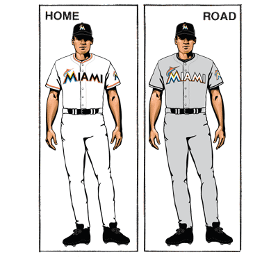
The Marlins have been in the league since 1993 and chose an odd Teal, Black and Gray color scheme to start off their existence. They used variations of that color scheme until 2012 when the team had a complete overhaul. As the team prepared to embark on a new chapter by moving into a brand new stadium with a new manager and a ton of new high priced free agents, they decided to change their uniforms and logo as well. The team must have had little left in the budget for uniforms after the price of the stadium and payroll because the uniforms looked like a company softball uniform. A debate can probably be started to discuss what was the bigger disaster: the uniforms or the play on the field?

6. 1975-1986 Houston Astros
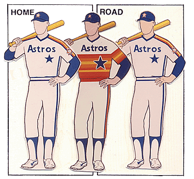
When the Houston Colt .45's renamed themselves the Astros for the 1965 season, they switched their uniforms to a fairly simple "Astros" across the chest with a shooting star across the top. The color scheme changed from a blue and white (with hints of orange) to an orange and white combination for the 1970 season. Starting in 1975, they apparently couldn't bring themselves to decide on just two colors because their uniform had a little bit of everything but green in it. Amazingly, some of the greatest Astros in the history of the organization wore the rainbow uniforms. Nolan Ryan, Mike Scott, Glenn Davis and Jose Cruz all spent the best parts of their careers in hideous fashion. The results are what matter and the Astros won. The team reached the playoffs in 1980, 1981 and 1986. All three times they lost to the eventual World Series champions (1980 Phillies, 1981 Dodgers and 1986 Mets).

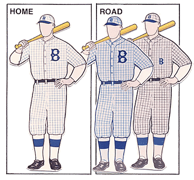
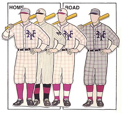
We rarely see major variations of the base color of uniforms. Throughout history home uniforms are usually solid white and road uniforms are solid gray with a logo, team name or city name across the chest. The most common drastic difference is the pinstriped look that we see on the Yankees, Phillies or White Sox uniforms, for example. When I was recently reading up on the 1916 World Series I came across these beauties (modeled below by manager Wilbert Robinson) with the checkered pattern. At any rate, they were only in use for two seasons but made an appearance in the 1916 World Series as the Dodgers lost to Babe Ruth and the Red Sox.

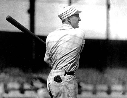
4. 1916 New York Giants
The Giants-Dodgers rivalry was in the infant stages but was rarely more vicious than at this time. The intensity of the rivalry at this period can largely be attributed to the hatred that grew between Wilbert Robinson and John McGraw, formerly the best of friends. Coincidence or not, the Dodgers and Giants both sported the checkered pattern uniforms during the 1916 season. The Dodgers had success with the pattern in 1916, reaching their first World Series. The Giants did not and switched back to their previous pinstripes in red with a gray road uniform in 1917. Apparently there is something to the success of a uniform as they returned to the World Series for 1917. The classic Giants black and orange (the reason Duke Snider would hate Halloween) would not come to the Giants until John McGraw had retired. The now famous Giants colors were introduced by McGraw's replacement, Bill Terry.
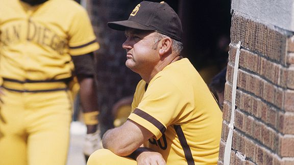
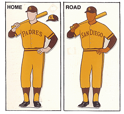
3. 1972-1973 San Diego Padres
The Padres may be able to consider themselves lucky that they weren't wearing floppy shoes and red wigs but we can doubt that any of them thought it could get any worse than these uniforms. The Padres were owned by Ray Kroc, owner of McDonald's, who decided to dress his players in the same color scheme as his hamburgers. The all beef colored brown with the mustard colored uniforms were only used for two seasons but the color scheme remained in variations up until 1985 when they moved to a more white, brown and orange scheme. In the picture below Don Zimmer is seen looking pensive. Considering Zimmer has worn the Dodgers, Red Sox, Yankees and Cubs classic uniforms it kind of makes you wonder how disgusted he was wearing this thing.
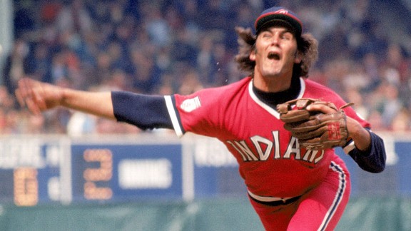
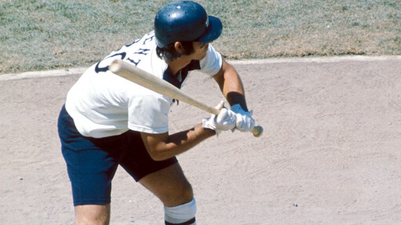
For the second ugliest uniforms in the history of baseball it was only fitting that the image used would be one of the ugliest pictures in the history of baseball. 1975 was a monumental year for baseball. The Big Red Machine dominated the National League. The Red Sox, led by Fred Lynn and Jim Rice won the American League. One of the greatest World Series of all time took seven classic games to be decided and Frank Robinson had the honor of being the first African American manager in major league history. Unfortunately for Frank he was manager of the Indians. Since 1960 the franchise had finished higher than 4th only once, which was a third place finish in 1968 (21 games behind the first place Tigers). Robby's bitter sweet appointment to the lowly Tribe can lead to the philosophical question: why do bad teams happen to great managers? Another great question would be why do bad uniforms happen at all? The 1975 Indians had a new look roster including Robinson as the DH Player/manager and a new first baseman in Boog Powell. Powell dressed in the uniform for the first time, looked in the mirror and told his team mates "I look like a massive blood clot." Given Powell's size and shape he probably could have better compared himself to a ripe tomato.
1. 1976 White Sox (3 games only)
Bill Veeck was very similar to Charlie Finley in some ways: always looking for ways to get people in the seats. He was the mastermind behind Disco Demolition night and Five Cent Beer Night. He once decided that the player's batting average was not as important a stat as their "failure percentage" and had his scoreboard operator display the percentage of times the batter had failed to get a hit. The players were not too happy about that one but they flat out revolted when they were forced to wear Softball style uniforms with shorts. Comiskey Park was not always well manicured so you can imagine the fear the players would have had of trying to slide in shorts. Fortunately for the ChiSox Comiskey realized the mistake, or realized his players would probably completely revolt if he didn't switch back to normal uniforms. After 3 games the shorts were gone.
Have any other suggestions or a different list? Email me your list or leave a comment.
Funny post, Mike. I was cringing at every photo I saw. Makes you wonder why Yellow was the go-to color for so many old uniforms? And those Brooklyn Robins uniforms look like pajamas! Wow... Truly some bad fashion on display in this top ten. Keep up the good work.
ReplyDeletejth
Thanks. There were plenty of options to pick from. it was kind of difficult narrowing this list to ten so you may see another 10 ugly uniforms sometime soon. The amazing thing to me is how many of these uniforms wound up in the playoffs or World Series.
ReplyDeleteLoved the article. I don't think Jason Werth read the section that states that every player should be neat and clean.
ReplyDeleteEvery team is now changing uniforms. Have been to 8 Reading Phils games and have seen 5 different uniforms( most of them ugly). There is one uniform that Reading has worn that looks like the Altoona Curve. Black with gold numbers. Altoona is a farm team of Pittsburgh. In the minor leagues all the changes are money driven. People must have the newest item no matter how foolish it looks.
I too think the Brooklyn Robins looked like a pair of pajamas. Then I saw the New York Giants uniforms for that one season and realized I DID have a pair of pajamas that looked like that. Too bad i threw them out. I could have sold the pair to a sports collectable shop.
My least favorite uniform is the brown in the Padres uniform. Just butt ugly. Looks like a UPS uniform.
I agree with you on the # 1 selection. all that is missing is the keg of beer.
TJD
The rules for what is considered "neat and clean" definitely varies by teams. The Reds and Yankees both have team policies forbidding facial hair other than a mustache, obviously Washington does not. I have not seen the new Reading uniforms but based on the new logos I can only imagine what they look like.
DeleteI also thought of pajamas when I saw the checkered uniforms of the Robins and Giants. I think the concept art for the uniforms didn't look THAT bad, but they definitely didn't translate well on the field.
ReplyDeleteShort pants remind me of little school boys, so it was sort of funny to see Bucky Dent wearing them. lol
Maybe it's just me, but I actually think the rainbow effect on the Astros and recent Marlins was actually whimsical. :D
I grew up with the Astros uniforms so they were all I knew until they changed in the mid 1990's. What made the uniforms even worse was they matched the colors of the seats in the Astrodome. If the stadium was empty it sometimes looked like the pitch was coming from the seats.
DeleteYou made my day! I am very happy and relaxed too that I find this blog. I was looking for the matter discussed in blog post. If you have some more blogs on the material please share those as well. Thanks a lot and keep sharing such useful information.
ReplyDeletefull dye softball jerseys